In Use:
Providing in-depth coverage of the use of a mobile phone might take a bit longer than anyone would carry to read. We'll cover some of the basics, while also capturing a few looks at the device's screen.
While the screen may not be very large, I did like it for most basic applications. It is bright, text is easy to read, and navigation is fairly easy thanks to the on-screen menu. For things like web browsing and viewing high resolution photos it wasn't very useful, but any device at 240 x 260 pixels will be the same.
I am not a big talker, but do use the phone a bit each day for conversations, as well as texting, e-mails, RSS reading, and a variety of other tasks. I found the battery life to be pretty respectable. With my typical usage I was able to go at least four to five days between charges, but did see that with Bluetooth enabled and/or increased talking the duration went down quickly.
While in areas where other smartphones on hand would connect via the 3G network, this one always connected on the Edge network. For the limited amount of data I move, everything seemed just fine anyway. Voice quality was not the best I have experienced, but overall it was acceptable. On occasion I had echoes and a bit of hiss, and my general complaint was that the phone was just too quiet. Not just from the ear piece, but everything about the phone seemed muted. The ringer, ear piece, and speaker phone should all really be louder. Get into an environment with a bit of noise and you can't always hear conversations or even that the phone is ringing (despite being set to 'loud').
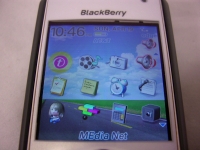
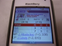
The below left image shows the main screen when using the BlackBerry default theme. You have a variety of icons, and the link for the web browser is another reminder that this was a T-Mobile product. The below right image shows a box score for a recent Yankee game at MLB.com. For websites developed for mobile devices things look just fine.
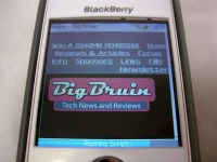
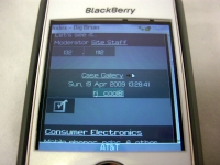
Due to the small screen and relatively low resolution, other websites aren't so usable. Here we see Bigbruin.com and the forum, and just how hard they are to navigate.
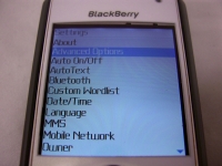
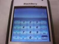
The final set of images are intended to show how text looks on screen, as well as how applications with graphical user interfaces look. Device menus, e-mails, text messages, and so on were all easy to read. Programs such as the calculator shown below were equally clear and easy to use.
