In Use (Mobile Apps):
While you could definitely dive way deeper in to the functions and performance of the Fibaro Home Center Lite, we will move on to take a look at their mobile apps. They actually offer specific apps for phones and tablets, which is an interesting approach. It allows the larger format of a tablet to provide more of a configurable, graphical touch controller, while the phone app is a bit more rigid.
The images below show some of the basic screens from the phone app. You have a fixed menu of items that can be moved around, but they can not be deleted. There are two panels with nine icons each, as well as a strip of smaller shortcuts along the bottom. I would like more control over the app, for example, to eliminate icons I don't want (window blind controller, LiLi voice control, and a video gate will never be used). I'd like to maybe squeeze it all down to one panel, and then perhaps have flexibility with how it was laid out. Let me group things as I see fit, as it is now if you click the Lighting icon it is then going to drill down to the rooms in your house with lights, and then you select the appropriate room and you can see the lights in it. I would like all lights to be available on one page for convenience.


The next images were first seen in our review of the
Zooz ZEN06 Z-Wave Plus Smart Plug, but I reference them again to show how the Fibaro phone app works. I was accessing the controls for a 9W LED lamp, and in the first screenshot the lamp was off and therefore drawing 0.0W, as indicated. Using the app to toggle the lamp on, the icon changes and immediately it reports power consumption of 9.33W (as shown in the second screenshot).


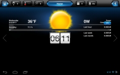
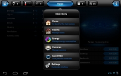
Next we have a few screenshots from the tablet app, which is intended to be viewed in landscape orientation. The layout is more flexible than the phone app, as you can fill the blank space under the clock with a bank of toggles or indicators of your choosing. So, you can have sensor status indicators, scene triggers, or individual light switches all shown together. There is a drop down menu accessible from the big blue Home button that will take you to pages for your rooms, cameras, etc, so navigation is quite easy.


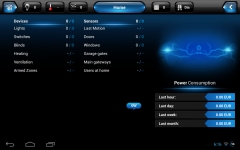
Scrolling to either side will give you more information, such as the very through device / consumption screen shown in the below left image. Nothing is indicated here, but it would show you all your devices, their current state, and your power consumption information.


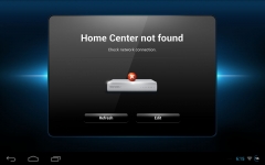
The above right image is a screen I would get on occasion with the tablet, as well as something similar with my phone. Whether I was accessing the Fibaro HCL remotely or locally, sometimes the apps would just say they could not connect. I would log out and back in to the app, refresh my network connections, physically verify that the HCL was actually up and running, and nothing seemed to make sense regarding the broken connection. Eventually I thought to try accessing the HCL from a browser on the same phone or tablet, and it would connect without issue. Whenever this type of issue would pop up on my devices, switching to a browser allowed me to do what I wanted to do, minus the convenience of the mobile app interface.